Hello,
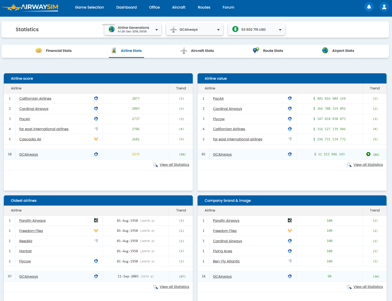
As illustrated in the above screenshot, I believe it would be better for non-mobile viewports to have stats in a "two column" layout, similar to what it was in the old website. At the moment, we have to scroll quite a bit to get to all the information, and most of the screen is occupied by whitespace.
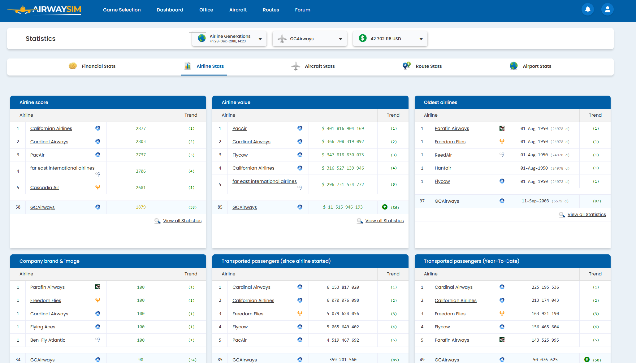
For reference, the above screenshot was achieved by adding a couple of "flex" css properties into the markup.
Thanks !
PS: Max viewport size could even accommodate 3 in a row very comfortably if not for very long ailine names ... :
To leave a comment, please authenticate.

